Borracho Taco
Borracho Taco is a new Mexican restaurant concept targeting college students in the South Tampa area. It aims to be a casual nightlife restaurant and a cool hangout stop on lively weekend nights.
problem
I was contacted to develop a logo and a brand identity for the restaurant and help guide the owners on the best way to position their brand. The three owners were divided on whether they wanted to go with a concept of a sugar skull as a logo or something that communicates fun, California surfer life. The logo had to be fun and colorful with stylized typography that either resembles graffiti or tattoo stencils.
process
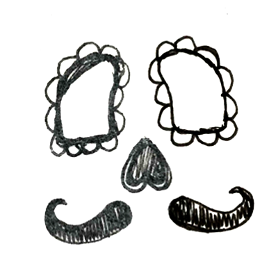
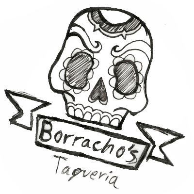
Logo sketches were done to explore the various options and styles to potentially implement. Sugar skulls, icons and illustrations referencing a California surfer lifestyle were considered.
Once the logo and shape were developed, we began to explore color and typography. Different styles of tattoo styled fonts were reviewed and considered. At one point in the process, we even explored the idea of creating our own font.
solution
I developed a fun, colorful logo to resemble traditional Mexican sugar skulls. The logo consists of thick and thin lines forming the contour of a skull and eventually blending into the tattoo inspired typography. The color scheme is a fun quadratic color that is both visually appealing without drowning out the rest of the design.
initial sketches
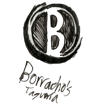
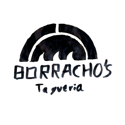
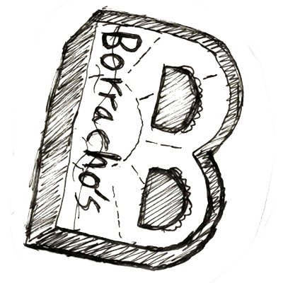
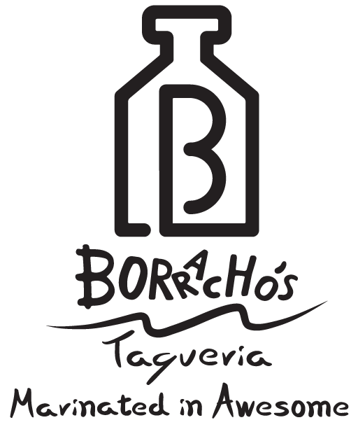
The initial concepts for the Borracho Taco logo consisted of sketches of a stylized letter “B,” sugar skulls, icons and shapes that represented a sunset on the beach.
One concept that made it very far in development was a “B” and a bottle that was formed from one continuous line. This concept was ultimately scrapped towards the end of the creative process and ultimately replaced for a colorful and bold sugar skull.





final logo design
The final versions of the logo consisted of the Borracho Taco name being incorporated in the illustration. The “B” in Borracho extends down merging with the outline of the left side of the skull while the “T” in taco wraps around the bottom part of the skull’s teeth. Decorative shapes were added to both sides of the skull to balance out the design as well as to add a bit more flare.
my contribution
I was the sole designer that worked on the Borracho Taco brandmark. I was responsible for concepting, pitching and developing.