

Zheng's Expedition
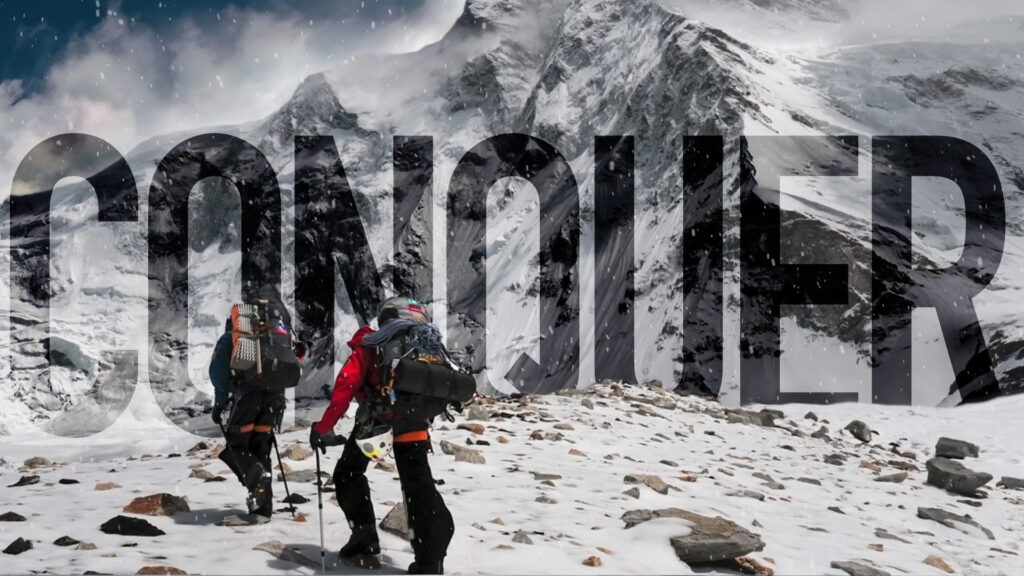
“Zheng’s Expedition” is a concept project I created to experiment with my newly acquired skills and tools in After Effects. The idea was to take a captivating still image and break it down into different layers, then animate each layer to produce an animation from a single image.
problem
After completing an animation for one image, I decided to extend the project by applying the same effect to two other images. My objective was to create an animated trailer for a travel agency that specializes in providing services to hikers, mountain climbers, and adventure enthusiasts. However, I encountered a challenge when I realized that I have not yet come up with a name for this agency.
process
I decided to name the company after a well-known voyage or explorer. I conducted research and found a suitable reference. Once I had finalized the name, I proceeded to work on different logo options and art direction to bring the entire project together.
solution
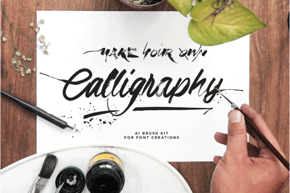
Zheng He, the famous Chinese explorer who went on seven expeditions, inspired the project’s art direction with Chinese-inspired lore. The logo features his name in a brush-like calligraphy font with the family surname in Chinese script above it. The branding also includes a bold condensed font to contrast from the elegant and organic feel of the calligraphy font.

inspiration
While researching brand influences, I developed a standardized art direction. I chose Zheng He as the inspiration and explored scripts, brushes, fonts, and animations effects to enhance the Chinese inspired aesthetic.


final logo design
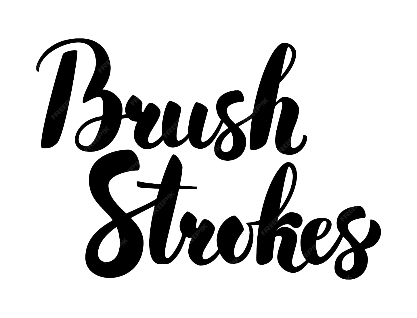
The final logo for Zheng’s Expedition consisted of three unique elements. Firstly, the name “Zheng’s” was written in Adlery Pro font to create a brush-like calligraphy aesthetic. DIN Condensed Bold was also used as a subhead to provide a bold contrast to Adlery Pro. Additionally, DIN Condensed Bold was used as the primary typography throughout the video, making it a key typographical focus point. The font’s boldness ensured that it remained easily readable, even when stylized effects were applied to it. Lastly, the logo featured a Chinese script of the surname Zheng, which added a nice flare to the design while further embracing the lore and history behind the influence of the brand. Although this script may not be immediately noticeable to viewers, it contributes to the overall visual appeal of the logo.
my contribution
I worked alone on the Zheng’s Expedition, handling concepting, art direction, and video and logo design.