


Information Age Systems
Information Age Systems is an IT service and software development company that provides IT solutions for a wide variety of industries based in the Philadelphia area.
problem
Information Age Systems was looking to boost their inbound marketing, as well as refine and reinforce their existing branded materials. Their website was outdated and did not accurately communicate all of the services that the company currently specialized in doing. The navigation system of the website was very outdated, and across the site, there were broken links and pages which were not SEO optimized.
process
After evaluating the touchpoints of the brand, we began the process of redesigning their website. The existing logo and brand elements were strong enough that it didn’t warrant a redesign, but they were not being utilized in the most effective ways on their website.
Wireframes were developed to understand the desired flow of the site as well as to visualize how the brand elements would be implemented from a design and branding standpoint.
solution
A new SEO and mobile optimized website was developed with a clear tier system of pages that would allow users to navigate the site more effectively. Existing brand elements, such as square patterns, green squares and vector illustrations, were all implemented to maintain the strengths of the previous site. Purple was also introduced as an accent color to make the brand appear more luxurious rather than value-oriented.

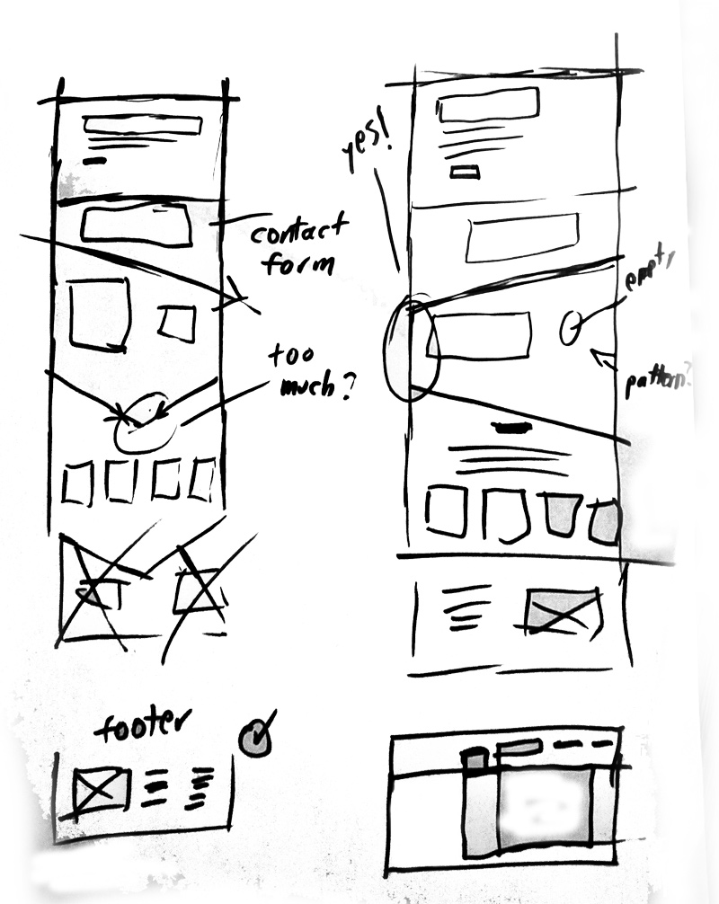
wireframes
During the wireframe process, layouts were explored to understand where each element would be placed and how it would affect the overall flow of the page. Sketches were also done for the navigation to find an organized way of structuring all of the services to ensure a good user experience.


final website design
An edited version of the original square patterns was brought over from the previous site because the original pattern contained too many squares, and they were often colored green making it visually dominant when compared to the rest of the content on the page. Our solution was to reduce the number of squares in the pattern and tone it down to a subtle gray. The green pattern was only to be kept when it was overlaid on header images.
On the homepage, the green pattern can be seen implemented on top of the hero image with a hover parallax, which provides users with a fun and engaging way to interact with the site upon visiting the home page. This decision was not carried to the rest of the site due to it having adverse effects on the page speeds, and instead, it was implemented solely on the home page to retain visitors.

my contribution
I was the sole designer that worked on this project with the feedback provided by an director. I was responsible for concepting, wire framing, pitching and developing the website for Information Age Systems.